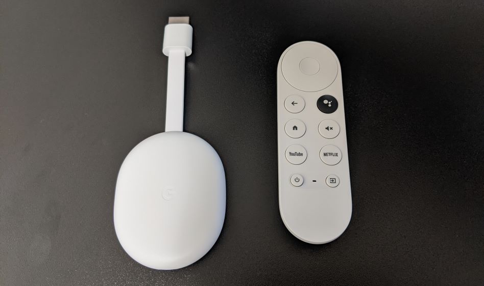
The newest Chromecast device from Google is out, and this year, it’s the biggest re-design yet, with 2 long anticipated features: a remote, and a full navigable user interface that ditches the requirement to control the device from a phone.
This year’s device is something more akin to a Roku, or an Amazon Fire TV stick than the previous Chromecast devices. How does it stack up to these cheaper streaming devices?
What we liked
-
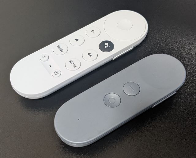
The new Chromecast remote (above) takes design cues from the defunct daydream controller.
A nice streamlined remote lets you navigate and control playback without fumbling with your smartphone (finally!)
- Support for virtually all streaming services (with the notable exception of Apple TV+).
- Slick UI cleans up some of the gripes of older Android TV based devices.
- Almost free for Netflix Subscribers ($6 net cost with 6-month Netflix bundle).
- IR universal remote functionality makes sit-down-and-watch experience a breeze.
What we didn’t like
- 8GB of storage space (~5GB available to user) leave hardly and space for games and such.
- No Stadia support (yet).
What was meh
- IR functionality only allows you to map the power, input, and volume keys to a single device each.
- In other words, it’s impossible to turn on your TV and sound bar with a single button press (like it is with other Android TV devices, and Fire TV devices).
- Baked in Netflix and YouTube buttons may irk people that don’t use those services.
Pick one up
You can pick up the Chromecast with Google TV from Google’s store.
Netflix subscribers, be sure to check out the 6 month Netflix bundle.





Thank you
I’m impressed, I must say. Rarely do I encounter a blog that’s both equally educative and interesting, and without a doubt, you
have hit the nail on the head. The issue is something not enough
people are speaking intelligently about. I’m very
happy I stumbled across this in my hunt for something regarding this.
This is certainly a superb blog post. Many thanks for sharing it!
Hi would you mind letting me know which web host you’re using?
I’ve loaded your blog in 3 completely different web browsers
and I must say this blog loads a lot quicker then most.
Can you suggest a good internet hosting provider at
a honest price? Cheers, I appreciate it!
We use WordPress 6.4.2. it works well for us and I’m glad you have found it flexible.
Hey there great blog! Does running a blog similar to this take a great
deal of work? I’ve very little expertise in coding but
I was hoping to start my own blog soon. Anyways, if you have any recommendations or tips for new blog owners please share.
I understand this is off topic however I simply needed to
ask. Appreciate it!
This is an absolutely outstanding article! Your clear, insightful, and detailed writing is a testament to your expertise. Every paragraph offers valuable information, and your ability to explain complex topics so effectively is impressive. Thank you for such a high-quality read. Regards
Just desire to say your article is as astonishing.
The clearness in your post is simply cool and i can assume you are an expert
on this subject. Well with your permission allow me to grab your
RSS feed to keep up to date with forthcoming post. Thanks a million and please keep up the rewarding work.
Hello there, You’ve done a great job. I’ll certainly
digg it and personally recommend to my friends.
I am confident they will be benefited from this website.